
The maps don’t lie about where heat turns lethal first.
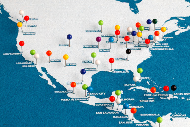
NASA’s satellites have been scanning American streets and rooftops, turning city maps into thermal confessionals. The patterns are brutally consistent. The hottest blocks show up where tree cover is scarce, asphalt sprawls wide, and homes struggle to stay cool when the sun refuses to back down. These images are not abstract—they are warnings made visible.
These aren’t just gradients on a screen. They are neighborhoods with names, histories, and families carrying the weight of triple-digit weeks. What the heat maps reveal is not random. It is a stitched-together story of infrastructure, policy, and survival that repeats from one metro to the next. Once you know which streets glow after dark, it’s impossible to ignore how much risk is coded into a zip code.
1. Phoenix bakes hardest where shade never falls.
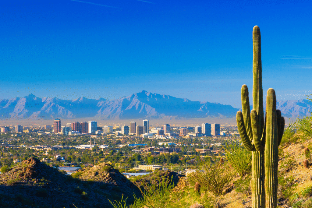
Thermal imagery shows Phoenix’s heat clustering in west and central neighborhoods, where older apartments line wide streets with little canopy. Maryvale and Central City are among the zones where surface temperatures stay elevated well past sunset, while nearby Sky Harbor’s surroundings glow like a furnace on NASA’s ECOSTRESS scans. These are not marginal differences; some blocks run more than fifteen degrees hotter than leafier districts according to the agency’s Earth Science Division.
The families here live with this reality daily. Sidewalks burn, nights stay stifling, and cooling units struggle against the relentless heat. For residents without reliable air conditioning, survival becomes about improvisation—shade tarps, swapped fans, and neighbors checking in on one another. Phoenix is already planting trees at record pace, but the growth curve lags far behind the thermometer. The city’s satellite profile simply confirms what anyone walking those streets already knows by feel.
2. New Orleans suffers when water and heat collide.
Satellite data reveals some of the city’s hottest tracts in older districts where pavement and low canopy combine to trap warmth. Central City, Bywater, and the Lower Ninth Ward consistently show up as glowing red on NASA’s thermal maps. The difference from shaded areas near Audubon Park is stark, and the numbers climb high enough to strain even working air conditioners, as reported by the DEVELOP program.
For many families, this is another slow-motion disaster layered on top of storm risk. Bills balloon as cooling systems grind around the clock, while residents in older homes endure indoor temperatures rising into the dangerous range. Clinics quietly note increases in dehydration and heart stress during these stretches. The maps put precision to what locals already know: heat punishes hardest where shade is absent and resources are thin.
3. Baltimore’s redlined past still dictates hot nights.
NASA’s scans of Baltimore show extreme heat holding in historically underserved areas. West Baltimore, Upton, and Broadway East radiate warmth well into the night, with temperatures remaining dangerously high compared to tree-covered neighborhoods. Research cited by the agency connects these conditions directly to legacy redlining policies that shaped tree canopy distribution. Decades-old housing maps line up almost perfectly with modern thermal images.
This overlap explains why certain zip codes see more heat-related illnesses and higher summer hospital admissions. Residents experience nights where even after the sun sets, streets and rooftops keep bodies under strain. The lack of shade is not accidental; it is the consequence of structural disinvestment. Baltimore’s heat profile shows how history compounds climate risk, and how satellites now make visible the inequalities that have long defined who gets relief and who doesn’t.
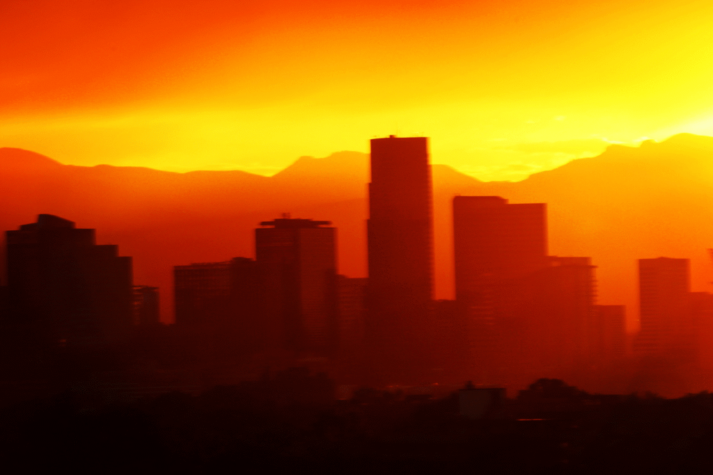
4. Houston keeps breaking its own records.

The sprawl of Houston turns into a patchwork of extremes during heat waves. Areas like Gulfton, Kashmere Gardens, and Near Northside glow hotter than affluent districts lined with trees. Miles of freeways and strip malls absorb heat by day and release it back at night, leaving families in aging apartment complexes with no relief. Even after midnight, the difference between neighborhoods can exceed ten degrees.
This isn’t just inconvenience. It forces people into impossible decisions—turn the air conditioner on full blast and risk a bill they can’t pay, or ration cooling and hope no one collapses. Hospitals anticipate predictable spikes in emergencies during these weeks. The maps confirm what residents feel each evening: Houston’s concrete and inequality form a perfect storm of dangerous heat that doesn’t let up when the sun drops.
5. Las Vegas glows brighter than the neon signs.

The Strip is not the only part of Las Vegas burning under relentless heat. Neighborhoods like East Las Vegas, the Historic Westside, and Naked City reveal themselves as thermal hot spots on NASA’s scans. Streets and rooftops trap desert sun until late into the night, and older housing stock without insulation magnifies the effect indoors.
For residents, cooling is never guaranteed. Portable units strain, bills climb, and nights become endurance tests rather than rest. Meanwhile, tourists stroll through air-conditioned atriums and elaborate water features, highlighting the city’s divide. The glow on the map mirrors the lived imbalance—extravagant cooling in one district, while entire neighborhoods nearby endure suffocating heat that feels endless.
6. Detroit’s asphalt deserts deepen old wounds.
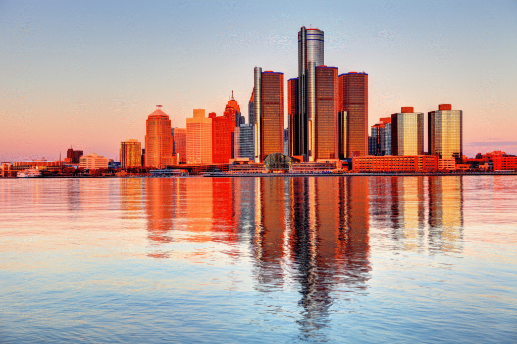
Detroit summers are often overshadowed by its harsh winters, yet thermal scans prove the city has a hidden summer crisis. Neighborhoods such as Osborn, Chandler Park, and Southwest Detroit hold onto the day’s heat well after sunset. Vacant lots that might have been turned into parks often sit bare, reflecting or radiating instead of shading.
Older residents speak of opening windows and feeling no relief as thick, hot air lingers. For many living on fixed incomes, running an air conditioner is not an option. Emergency services see predictable spikes in calls when nights refuse to cool. In these neighborhoods, climate risk compounds with economic strain, turning what should be ordinary evenings into survival tests. The satellite maps only highlight what residents have long endured without fanfare.
7. Los Angeles heats unevenly across its sprawl.

In Los Angeles, the divide is clear from the air. Pacoima, Boyle Heights, and South Los Angeles blaze hotter on NASA’s imagery than the shaded neighborhoods of the Westside. Flat roofs, sparse canopy, and endless pavement create conditions where heat lingers late, raising health risks for families already under economic strain.
Hospitals in these neighborhoods report more heat-related emergencies than their coastal counterparts. The difference comes down to decades of investment—or the lack of it—in green space and infrastructure. For those living under the glow of these maps, the city’s reputation for sunshine feels less like a blessing and more like an unrelenting hazard that won’t release its grip when night falls.
8. Miami faces the squeeze from both sides.

Miami’s heat maps show inland neighborhoods like Little Haiti, Allapattah, and Liberty City running hotter than the wealthier coastal zones. Sparse shade, heavy pavement, and older housing stock converge to keep these blocks glowing long after sunset. Air conditioning bills soar, eating into already thin household budgets.
For families unable to keep cooling systems running, the risk escalates quickly. Children, seniors, and outdoor workers feel the brunt. Rising seas add another layer, forcing many displaced from coastal neighborhoods into hotter inland districts. The combination ensures that those with the fewest resources bear the greatest share of risk. NASA’s images bring sharp focus to what residents here already know—heat amplifies the inequalities baked into the city’s housing map.
9. Chicago’s west side tells the sharpest story.

Chicago’s thermal scans put North Lawndale, East Garfield Park, and Little Village among the city’s hottest after-dark neighborhoods. Pavement and rooftops soak up the day’s sun and release it slowly, creating nights where temperatures remain punishingly high. These communities, already shaped by economic disinvestment, face a climate burden layered on top of long-standing challenges.
Inside apartments without central air, families rely on box fans and open windows that do little to cool the heavy air. Hospitals brace for spikes in heat emergencies that map almost exactly onto the same neighborhoods year after year. The overlap between history and climate here is undeniable. What NASA’s satellites expose in bright color is the same story residents live in sweat and restless nights. The city cools unevenly, and in these corridors, relief never truly arrives.